Friday, August 8, 2008

Viral - some interesting observations

This is taken straight from Go Viral's newsletter - so big up to them!

Newsletter from GoViral
Cannes Lions 2008 and Females in viral campaigns

Dear Reader,
Welcome to our July newsletter. In this edition, we take a closer look at Cannes Lions 2008 winners Microsoft's "Halo 3" and Burger King's "The Whopper Freakout". This monthly insight tunes in on the lack of viral campaigns targeted against women.
In the last newsletter we introduced you to our new book "The Social Metropolis" – it is now available for free download here . You can also enjoy our seminar in Cannes here .
Enjoy!


Cannes Lions 2008 – Microsoft's Halo 3 and Burger King's "The Whopper Freakout"
We have again reached that time of the year, where advertisers from all over the world gather and celebrate the passing year and select their favorite commercials. This year's viral contestants included Burger King's "Whopper Freak out" and four spots from Halo 3.

Microsoft's Halo 3
T.A.G. and McCann made a homerun and won the Grand Prix prize in the Film category for the Halo 3 Believe campaign, which included 'Gravesite,' 'Enemy Weapon', 'John 117/monument' and 'Combat' for Microsoft's Xbox 360. The four spots are part of larger campaign, which initiated at the end of 2006. The campaign consisted of five major phases (that you can read about in our new book ) until its release on September 25th 2007. The overall theme of the campaign is rather untraditional for a computer game. Users are guided around in the remnants of a post-world war, taking place after the two first games. Real actors play the roles of surviving veterans guiding the users through a memorial walk of the wars. The four spots were a part of phase 5 and apart from them, it consisted of a Halo 3 website, serving as a virtual museum, providing an interactive fly through of the entire John 117 monument – allowing visitors to peek right into the fight. They could also learn more about our enemies and hear first hand stories from the men, who were there. The four spots consist of interviews with surviving veterans of the battle who served with Master Chief. They talk about their experiences and speak with reverence and awe about what it was like to serve with mankind's greatest hero.
Watch Enemy Weapon
Watch John 117/Monument
Watch Combat
Watch Gravesite

Burger King's "The Whopper Freakout"
This year, "Whopper Freakout" – created by Crispin Porter & Bogusky, Miami – stood out and won gold in the cyber category. Depriving Whopper fans of their favorite burger turns out to be a surefire way to get them to buy more. To coincide with the 50th Anniversary of the Whopper, Burger King conducted a social experiment removing the Whopper from the menu. On December 2007, a variety of television, interactive, radio and print executions rolled out and whopperfreakout.com was introduced. Hidden cameras show what happens at two Burger King outlets, when a actual Burger King customer is being told that the chain no longer serves Whoppers. The campaign explores the emotional attachment that people hold towards products and in this case – the Whopper. The clips document the reactions from upset customers. One reaction was: "What are you going to put on the logo now -- home of the 'Whatever we got'?". The message was clear – people didn't like it. The campaign was a huge success and drove sales of the Whopper up by 29%. The website created for this campaign received 4 million views by mid-March, and had 250,000 unique visitors in the month of December alone. Spoofs of the TV ads were created and posted on the internet. Not only did the campaign help strengthen the sales at Burger Kings restaurants nation wide, but also, competitors showed signs of slower traffic.
Watch The Whopper Freakout here

Insight of the month: Lacking focus on females in viral marketing.
One of the seminars at Cannes Lions 2008 was held by Cheil Worldwide: A Day In The Life Of A Mobile Phone In Seoul. The seminar positioned delegates in the minds of YMCs (Young-Minded Consumer) living in the modern digital metropolis of Seoul. And through that experience, delegates saw how today's youth consumer is making the mobile device an extension of his/her existence. As Pernille Fruensgaard write on her blog , one of the interesting parts of the seminar was, that the mobile services discussed by Cheil were primarily targeted young females, and that these served as drivers of the services making them a natural part of their daily lives and social connections.
Right now, the nature of viral campaigns in Europe seems to be driven by and to masculine humor and the nature of females, linked up to networking and sharing of information/stories/gossip, is not addressed in viral campaigns. Interestingly, their nature would be a perfect catalyst for spreading a message, if it is possible to use in their social activities.
A study from Lucid Marketing concludes that women uses word of mouth more than men. Women are more likely than men to share a positive experience with a business (91% versus 83%), or a product (95% versus 89%). The same conclusion is found at Jackie Huba's blog , where she ask Michele Miller, co-author of the new book "The Soccer Mom Myth: Today's Female Consumer: How She Really Is, Why She Really Buys", to share five tips for understanding word of mouth and women. "Ask any woman how she found her hairdresser, doctor, or favorite wine, and she is likely to tell you that it was from a friend. Women are natural word of mouth spreaders. They are wired that way – with four times as many connections between the left and right hemispheres of the brain, women tap deeply into that area that is responsible for bonding and connecting with others".
So, brands for female segments should definitely not disregard word of mouth marketing, when planning future campaigns. In fact, it could prove a very profitable decision.

Subscribe to Go Viral's newsletter

Design for Emotion and Flow

Thanks Trevor @ Boxes and Arrows for this insightful post on approaches to IA

We create software and websites to display and represent information to people. That information could be anything; a company’s product list, pictures of your vacation, or an instant message from a friend. At this moment, there’s more information available to you than at any other time in history.

All this information has a lot of positive effects, but it also creates challenges. “What information consumes is rather obvious; it consumes the attention of its recipients … a wealth of information creates a poverty of attention” (Simon 1971). When attention becomes a scarce resource, it’s important to invest it wisely. Information architects and designers play a critical role in ensuring the products they design provide users’ with a return on their investment of attention.

The psychologist Mihaly Csikszentmihalyi (1990) has described focused attention as “psychic energy”. Like energy in the traditional sense, no work can be done without it, and through work that energy is consumed. Most of us have experienced a mental/emotional state where all of our attention (or energy) is totally focused on an activity. Csikszentmihalyi (1990) named this state “flow,” based on how participants in his studies described the experience.

In this state of consciousness, people often experience intense concentration and feelings of enjoyment, coupled with peak performance. Hours pass by in what seems like minutes. We tend to enter these states in environments with few interruptions, where our attention becomes focused by a challenge that we’re confident we can handle with our existing skills. Feedback is instantaneous, so we can always judge how close we are to accomplishing our task and reaching our goal. The importance of the task influences our level of motivation and perceptions of how difficult the task will be.

Attention and Flow

The elements associated with the flow state can be classified into the three areas; 1. Causes of Flow 2. Characteristics of Flow 3. Consequences of Flow (Novak, Hoffman and Yung, 1999).

1. Causes of Flow

  • A clear goal
  • Immediate feedback on the success of attempts to reach that goal
  • A challenge you’re confident you have the skills to handle

2. Characteristics of Flow

  • Total concentration and focused attention
  • A sense of control over interactions
  • Openness to new things
  • Increased exploratory behavior
  • Increased learning
  • Positive feelings

3. Consequences of Flow

  • Loss of consciousness of self
  • Distortions in the perception of time
  • Activity is perceived as intrinsically rewarding

As designers, we focus on the elements that precede or cause flow. Users visit sites with pre-existing goals (e.g., finding information about a product). These goals evolve over time as users complete tasks and their attention is drawn to other information. The main elements designers can control are:

  • Providing immediate feedback
  • Balancing the perception of challenge against users’ skills

Designing for Flow

You don’t need to take a course or learn a new software package to design for flow. In fact, you’re probably already doing it. Begin by considering the desired outcome of every interaction and then removing everything that distracts the user from accomplishing that outcome.

Start by removing distractions or impediments wherever possible. For both physical and interactive products, this means reducing or eliminating both external (i.e., environmental) and internal (i.e., pain, discomfort, anxiety) distractions that cause emotional responses like frustration or physical discomfort. Emotions demand and divert the user’s attention. Providing immediate feedback for all user actions helps to reduce user anxiety. The effective use of layout, information design, typography, interaction design and information architecture all help in balancing the perception of challenge against the user’s skill level. Information should be broken down into manageable “chunks” that don’t overwhelm users cognitive faculties.

When it comes to balancing the users’ perception of challenge, think of it this way: too much challenge with too little skill causes anxiety; and too little challenge with too much skill causes boredom.

Flow occurs at the boundary between boredom and anxiety. Think of it as a channel that runs between anxiety and boredom.(Figure 1)

Concept of flow
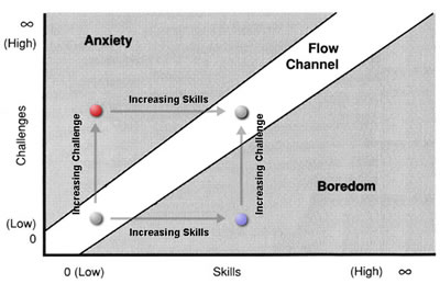
Figure 1:
Anxiety, Boredom and Flow (Csikszentmihalyi, 1990)
(captions added van Gorp, 2006)

As the challenges we face increase, we become more anxious and lose flow. Re-entering flow involves increasing our skills to match these challenges and reduce anxiety. As we increase our skill level, we become bored unless we increase the challenge to match our greater abilities.

To understand how we can reduce distractions, let’s examine the different elements of flow again to see how each can be applied to user experience. The causes of flow have the most implications for website and application design.

Causes of Flow

1. A clear goal…

The user navigates to accomplish a task, like seeking information on a particular topic or surfing for fun. This is an evolving goal, dependent on the options presented to the user and aided by logical information architecture, intuitive navigation, effective wayfinding and clear options for proceeding like information scent, breadcrumbs, meaningful labels, clear page titles, etc.

2. With immediate feedback on the success of attempts to reach that goal…

The user receives quick, sensory feedback in the form of a visual shift and/or sound from links, buttons, menus, or other navigation items.

3. Presented as a challenge that you have the skills to handle.

The opportunities for action are balanced with the user’s ability. At a basic level, this is accomplished by providing an uncluttered interface and eliminating unnecessary information to limit the user’s cognitive load. As the users’ skill increases over time, the interface can increase its complexity as well. Adaptive interface technologies allow the user to adjust the complexity of the interface to meet their enhanced skills.

Flow and Emotion

Flow tends to occur in situations with higher levels of challenge and skill. If the challenge is too easy, or user skill levels are very high, anxiety can be so low that there is little motivation to do anything. This level of activation or “arousal” in the body is the physiological (i.e., bodily) dimension of emotion. The level of arousal affects how intensely we experience a given emotion, and intense emotions demand our attention. In evolutionary terms, it’s easy to see why; the more attention your ancestors paid to predators, the more likely they were to survive and reproduce, passing their genes on to their descendants, people like you and me.

Both pleasant and unpleasant objects and experiences can increase arousal levels. Frustration and the excitement both increase arousal levels. So do large images, bright colors, and high contrast (van Gorp, 2006). For example, increasing the size of an image and moving anyone in it closer within the frame increase arousal levels.

Interpersonal distance and arousal
Figure 2: Interpersonal Distance and Arousal
How does looking at the picture on the right make you feel compared to the one on the left?

The key to balancing arousal is to match the perceived challenge to the users’ skill level. Since skill levels differ from one user to the next based on their previous experiences and the type of task, interfaces should be very user-friendly but also allow more advanced users to find challenges appropriate for their skill level. These challenges can include the visual aspects as well as the content (King 2003). To put it simply, everything about a site, including content, information architecture, interaction design, and visual design can contribute to flow.

Goal-directed vs. Experiential Use

Different motivations for using a website require different designs to facilitate flow (Novak, Hoffman and Yung 1996). Novice users tend to see the Internet in a playful way, while more experienced users tend to view the Internet in a more utilitarian way (King 2003). This leads to a distinction between experiential and goal-directed use. Flow tends to occur more often during goal-directed use, because of the higher challenge involved.

Novice Users – Experiential use

  • Less challenging
  • More exploratory
  • Entertainment-oriented

Experienced Users – tendency towards Goal-directed use

  • More challenging
  • Less exploratory
  • Connected with tasks (e.g. research, work and shopping)

The lower level of challenge in an entertainment-oriented, experiential site means there is a lower level of anxiety connected with its use. Someone who is less anxious is more capable of using creative thought to determine how to navigate a website and overlook minor problems. Motivation here is driven by subconscious arousal triggered by interesting visual elements, bright colors or high contrast. Experiential sites can and should be more arousing visually to demand the greater attention that can lead to flow experiences.

Disturbia film site
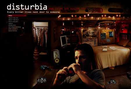
Figure 3: Disturbia film site
An example of a visually rich, entertainment-oriented site with little or no challenge involved.

The greater challenge of completing tasks (possibly under deadlines) on a goal-directed site creates more higher arousal. Anxiety makes users less able to think creatively when problems are encountered. If a product will be used in a stressful environment, like a hospital operating room, usability becomes crucial. All relevant information needs to be close at hand and visible and feedback should be clear and immediate. A goal-directed site can and should be less visually rich so that users, already anxious at the prospect of a challenging task, are not overwhelmed.
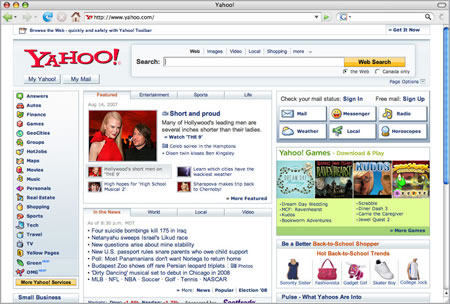
Yahoo
Figure 4: Yahoo

When tasks are particularly unpleasant, we often lack the motivation necessary to complete them. In these cases, increasing the arousal level through the use of narrative can increase the user’s motivation. The Tango Tax website uses visual elements that resemble those found in movie posters and has a high contrast, cinematic feel that increases arousal. The software also introduces the classic cinematic narrative element of “us vs. them” to help increase user motivation.

Tango Tax
Figure 5: Tango Tax website

Conclusions – Traits of Websites that Encourage Flow

How you apply these ideas depends on your target audience, as well as their internal and external use contexts. Consider the likely emotional state of your users. Are there loud noises, crowds, brightly colored objects or other distractions in the user’s environment?

Here are some basic website traits that will help to encourage flow.

  • Clear navigation: Make it easy for the user to know where they are, where they can go, and where they’ve been, by including signposts such as breadcrumbs, effective page titles, and visited link indicators.
  • Immediate Feedback: Make sure all navigation, such as links, buttons, and menus provide quick and effective feedback. Offer feedback for all user actions. When this isn’t possible, provide an indicator to hold the user’s attention while waiting (e.g., progress bar).
  • Balance the Perception of Challenge With the User’s Skill: Since user skill levels differ, it’s up to you to balance the complexity of the visual design with the number of tasks and features people can use. Consider whether they are likely surfing experientially for fun or completing an important task. Tailor your sites to your audience’s scenario of use: more visually rich for experiential use and less so for goal-directed use.

Adaptable interfaces that allow the user to increase or decrease the perceived challenge by choosing how much detail is displayed. Simplicity helps reduce anxiety for both novices and experts, which is especially crucial in highly stressful situations. Options for information-rich displays can introduce challenge for more experienced users.

Whether you’re an information architect, interaction designer or visual designer, your work should compel users to invest their attention, and then provide them with a return on that investment.Remember, designing for flow doesn’t require a new set of tools or skills – only a different way of thinking. Finding the right balance of design and challenge can help focus attention and create flow, which results in immersive and engaging user experiences.

References

Csikszentmihalyi, Mihaly. (1990). Flow – the Psychology of Optimal Experience. New York: Harper Perennial.

Csikszentmihalyi, M. (1977). Beyond Boredom and Anxiety, San Francisco: Jossey-Bass. Copyrights: Journal of E-Business (International Academy of E-Business). All rights reserved. Journal of E-Business, Vol. 1, Issue 2, December 2001.

King, Andrew B. “Chapter 2 – Flow in Web Design.” 2003. http://www.websiteoptimization.com/speed/2/ accessed on January 21/2007.

Fogg, B.J. (2003). Persuasive Technology – Using Computers to Change What We Think and Do. San Francisco: Morgan Kaufmann Publishers.

Hoffman, D.L, Novak, T (1996), “Marketing in hypermedia computer-mediated environments: conceptual foundations’”, Journal of Marketing, Vol. 60 pp. 50-68.

Norman, Donald A. (2004). Emotional Design – Why We Love (or Hate) Everyday Things. New York: Basic Books.

Novak, T.P, Hoffman, D.L (1997), “Measuring the flow experience among Web users,” Interval Research Corporation.

Novak, T, Hoffman, D, Young, Y (1998), “Measuring the flow construct in online environments: a structural modeling approach”, Owen Graduate School of Management, Vanderbilt University, working paper.

Novak, T. P., Hoffman, D. L., and Yung, Y. 2000. Measuring the Customer Experience in Online Environments: A Structural Modeling Approach. Marketing Science 19, 1 (Jan. 2000), 22-42

Rettie, R., (2001), An Exploration of Flow during Internet Use, Internet Research, 11(2), 103 – 113.

Simon, H. A. (1971), “Designing Organizations for an Information-Rich World”, in Martin Greenberger, Computers, Communication, and the Public Interest, Baltimore, MD: The Johns Hopkins Press, ISBN 0-8018-1135-X. pp. 40-41.

Simon, H. A. (1996), The Sciences of the Artificial (3rd ed.), Cambridge, MA: The MIT Press, ISBN 0-262-69191-4. pp. 143-144.

van Gorp, Trevor, J. (2006). Emotion, Arousal, Attention and Flow: Chaining Emotional States to Improve Human-Computer Interaction. University of Calgary, Faculty of Environmental Design, Master’s Degree Project.

At last - a really uselfull twitter application

If you thought microblogging was mindless prattle serving no good to anyone (i know my girlfriend does), then maybe this will help change your opinion and get you tweeting away

http://toanswer.net/

Harnessing the huge power of twitter: tons of people ready to talk about anything, toanswer let's you pose questions to the masses and hopefully get some good answers back. Kind of instant yahoo answers meets human search.

Interesting to see how it develops

Thursday, August 7, 2008

2008 Metaverse Tour Video: The Social Virtual World's a Stage

Thanks Gary Hayes at futurelab for this holiday video from the virtual universe

Gary Hazlitt and Gazlitt (aka as me!) take a ‘break’ in over fifty worlds comprising the current metaverse, here is the holiday video…

I am doing a commercial report and curriculum development on the evolving range of social virtual worlds and have recently ventured into fifty of them to review and sample the culture, creative, business and educational potential. On my travels I got out my virtual camera and decided to capture a bunch of small vignettes which quickly turned into a body of audio visual delights - so decided to create a nice seven minute video for posterity.

I thought I would share the video publically as it demonstrates how ubiquitous, popular and streamlined many of these spaces are becoming across the intraweb / ‘cloud’. With over 300 million frequenting or registering for the non-game based worlds and millions of new investment in 2nd and 3rd generation services there seems to be no stopping them…Enjoy


5MB MP4 Download available at http://www.justvirtual.com/SVWS_2008.mp4

A few immediate things that struck me on my travels:

  • That there are quite a few worlds now getting their balance on the shoulders of Second Life and really getting to grips with the social networking aspects vs the 3D’ness
  • There IS a balance between a social space and an ‘agreed’ advertorial world - “you give me valid experience, I accept a level of advertising”
  • A few new entrants realise that using a fully fledged, 3D game engine as the client for what is in the end a glamorous 3D facebook and requiring a high spec’d PC is not the best way. Second generation services like vSide have followed a good middle ground
  • As I reported a few days ago the ‘layered-over-the-2d-web’ version of these worlds such as RocketOn Exit Reality and Weblin show great usability and promise
  • Some worlds are demonstrating the precursor to photo realism and smooth motion while others have as much ‘immersion’ by providing intimacy with your friends in more cutesy environments
  • Many of these worlds operate without the hype we have seen with Second Life and have slowly been building up large communities. Beware any world that tries to launch on hype, as most of these worlds are still in adolescence and not ready for mainstream
  • The Metaverse is a world of connected worlds, how/when/if they are connected will be a real challenge from a technical and standardisation perspective. Especially as a few are starting to concentrate on themes, music, sport and probably in the end very defined niches - fly fishing social world anyone?
  • It is important for those who are supposedly representing or blogging about ‘the metaverse’ to get in there and try these services - beyond registering and wandering around for only 10 minutes (I could name several who haven’t a clue!) but…
  • There are not enough hours in the day to attempt to truly engage with each world but it is amazing how adept you become at spotting flaws and innovation when you put the effort in
  • lots more to follow from the official report in a future post…

KZero are turning out to be the best resource on the planet, tracking Social Virtual Worlds and their latent potential. They gave me permission to publish/post this great chart with a great stab at putting many of the worlds in the video across content sectors.

kzero_svw_sector.jpg

Here is a list of the worlds featured in my video in order of appearance:

Video details:

The ‘Social Virtual’ World’s A Stage
A Film by Gary Hayes © Personalizemedia 2008
http://www.personalizemedia.com

“This is not a Game” - Music composed and performed by
Gary Hayes http://www.cubrisound.com

Original post: http://www.personalizemedia.com/2008-metaverse-tour-video-the-social-virtual-worlds-a-stage/

Wednesday, August 6, 2008

Future web interface

Cool stuff from Adaptive Path:


Aurora (Part 1) from Adaptive Path on Vimeo.


Welcome to the future — well, one possible future, anyway.

This is Part 1 of Aurora, a concept video created by Adaptive Path in partnership with Mozilla Labs. With Aurora, we set out to define a plausible vision of how technology, the browser, and the Web might evolve in the future by depicting that experience in a variety of real-world contexts.

The release of Aurora is part of the launch of Mozilla Labs’ browser concept series, an ongoing initiative to encourage designers and developers to contribute their own visions of the future of the browser and the Web. Over the next couple of weeks, we’ll be releasing more video segments, as well as background material showing just what went into imagining the future of the Web and translating that into a video.

Wednesday night, join us at the Adaptive Path offices here in San Francisco to celebrate the release of Aurora and get an advance look at some of the video segments before they’re released. Also, at Adaptive Path’s UX Week next Friday, we’ll be presenting a case study about the project. There are still a few seats available — use promotional code “BLOG” for a 10% discount.

Tomorrow on the Adaptive Path blog: How do you predict the future?

Tuesday, August 5, 2008

Coping with Crackberries etc

With more and more people using Blackberries and iPhones to access their emails, clients who send email marketing campaigns need to allow for a different browsing experience because it will show as being read on their laptop or PC - therefore giving most readers no reason to (re)open it. A post by Jeanniey Mullen at Bulldog solutions suggests 3 tips to get round this problem.

Monday, August 4, 2008

Cuil loses its cool

Facebook app yanked

Thanks to Michael Estrin at iMedia Connection for this post found at:
http://www.imediaconnection.com/content/20101.asp


On the web, good news travels fast, but disaster spreads at the speed of light. See which brands belly-flopped this week, and how MySpace nipped a potential catastrophe in the bud.

News of a search startup aiming to take down Google is something of a regular occurrence, but when Cuil (pronounced "cool") exited beta this week, the company managed to dominate mainstream and industry headlines for about a day. That was the good news. The bad news was that the product itself took a beating from a lot of web watchers.

With thousands of media outlets covering Cuil, the search engine was probably a victim of its own hype. In fact, the site even crashed soon after it went public. How 1999!

But much of the backlash is undeserved, according to SearchRev CMO Eduardo F. Llach, who says he liked the results he got from his test searches. But a happy user may not equal a Google killer, Llach says, pointing out that neither Microsoft nor Yahoo has managed to come close to toppling Google.

That was an observation shared by John Battelle, who literally wrote the book on search. Earlier this week, he told iMedia that "the complete failure of any other company to gain significant share against Google" was the most significant thing to happen since he published "The Search."

So, what should Cuil do now? Focus on the quality of their results, says Seth Dotterer of Conductor, a search consulting firm.

"Cuil came out of the gate with an index of more than 120 billion pages -- a number equivalent to more than half of the stars in our galaxy," Dotterer explains. "It's a daunting number -- and great technical achievement -- but it's not a game changer for your typical searcher. Instead, they need to focus much more on the quality of their results, both from a relevancy and freshness perspective. This is the only way to win users' attention and ultimately their loyalty."

As for the hype surrounding Cuil's debut, TechCrunch published a cheeky post -- "How to Lose Your Cuil 20 Seconds After Launch" -- slamming the company for failing to live up to the promise of being dubbed a Google killer.

How to annoy half-a-million people
Here's a recipe for a digital meltdown. Take a wildly popular widget, add a mature brand and serve on Facebook. While that should have been a win for all involved, it turned out to be a lose-lose situation, says PR guru David Seaman, who criticized Hasbro for failing to see that Scrabulous, the unauthorized version of the Scrabble board game, was a huge missed opportunity for the brand.

"When news of the takedown notice spread, protest groups with tens of thousands of members sprung up on Facebook asking Hasbro to rethink [its decision]," Seaman says. "It should have. Think about the goodwill a change of heart would have created, and the grassroots buzz. Positive stories about how Hasbro 'gets' Web 2.0. You can't buy publicity like that."

For now, Facebook users in North America (where Hasbro owns the rights to the game) will have the option of playing the official version, which has so far attracted about 15,000 users. Or, they can play a modified version of the game called Wordscraper, released Thursday.

Catastrophe averted
Layoffs are never good, and rumors of layoffs -- even if they're unfounded -- can be crippling for any web company. Just ask AOL, which continues to suffer from widespread reports that its having a hard time justifying the editorial teams that crank out its empire of branded and non-branded sites.

But that fate didn't befall MySpace. When early word of performance-based firings leaked onto the web, and many were quick to ask if the Fox Interactive Media company had been forced into layoffs, Amit Kapur, MySpace's COO, swung into action. He quickly clarified the reports, pointing out that MySpace would replace the employees it was shedding, citing efficiency as the primary concern. But for those who were a little wary -- especially after a less-than-rosy financial forecast for digital this week -- MySpace had a ready-made answer in the form of more executives.

Before the story could create chaos at MySpace, Kapur and the rest of the MySpace team were ready to spin it into a tale of new blood for the company's executive ranks. In the short term, that was a minor save from MySpace (no company wants to be compared to AOL these days), but in the long run, the new hires could help the social network beat back inroads made by Facebook. Last week, Facebook failed to impress with its developer conference, leaving an opening for MySpace to get back some of its momentum, something that isn't out of the realm of possibilities with five new executives.

Big web
Finally, one story that got missed this week was a tidbit from Google. If you've ever wondered how big the web is, the team at Google has an answer -- 1 trillion. That's right, according to Google, there are 1 trillion -- and counting -- unique URLs on the web.

Yellowpages campaign

Yellowpages.com Campaign Shows Off Cross-Media Versatility
by Laurie Sullivan, Monday, Jul 28, 2008 7:00 AM ET

Yellowpages.com launched a billboard outdoor advertising campaign this month in five target markets from Detroit to Sacramento, Calif.

The campaign designed by WPP Group's Mediaedge:cia and created by GSD&M Idea City in Austin, Texas will eventually add viral media and local search. It already taps television and online ads.

Matt Crowley, Yellopages.com CMO, says the push plays into the company's initiative to help advertisers reach consumers across cellular phones, online and television ads. He says it is part of parent company AT&T's three-screen strategy to provide services not offered by other Internet-based business-to-business or business-to-consumer search companies.

Yellowpages.com, for example, offers mobile ads as part of its package of services, along with video business profiles. Consumers can download and share the video, which acts as a widget, or post to other sites.

The television channel 97 on AT&T's U-verse service also enables consumers to search for local businesses. Search capabilities for mobile, online and television allow Yellowpages.com advertisers to reach more consumers on a variety of devices.

Taking advantage of AT&T's partnership with Apple as part of that strategy, Yellowpages.com designed a cell phone application for the iPhone that lets consumers find and share business information based on local search. The application, built on Apple's software development kit, launched July 10.

Apple iPhone demonstration kiosks at AT&T Mobility and Apple retail stores promote the free-for-download-to-consumers app. Flyers in the stores tell consumers where to find them. AT&T also preinstalled a software application, known as a client, on select phones available in its stores.

The software client lets consumers access Yellowpages.com on their handset. "The search feature is on millions of devices today, but it will reach tens of millions by the end of the year," Crowley says. "The preinstalled applications and special treatment from Apple in AT&T stores makes a huge difference in the amount of traffic we can drive through mobile applications."

Apple reported selling more than 1 million iPhone 3G handsets just three days after it became available in its retail and AT&T Mobility stores. Tina Teng, iSuppli analyst, estimates that Apple will sell 8.8 million 3G iPhones this year.

Good news for Yellopages.com, especially on weekends when mobile traffic reaches peak use. The company typically experiences double-digit searches from consumers on handsets during those two days. "The majority of all searches on our Web site come from mobile handsets, compared with online," Crowley says.

As for rival Yellowbook.com, customers are rapidly moving to upgrade their advertising to reach consumers through video and mobile ads, according to the company's CMO Gordon Henry. "We began testing video ads earlier this year and started rolling them out this summer," he says. "The sales force and some business-to-business advertising will highlight the service to customers, but there won't be a national media campaign. We tend to use national media to talk about the brand, not a specific service."

The billboard is running in five markets: Atlanta, Orlando, St. Louis, Detroit and Sacramento.

Yellowpages.com has more than 140 million searches per month, and was ranked No. 26 in comScore's top 100 URLs for May 2008.

Mobile searches have increased more than 50% from September 2007 to March 2008.

Thanks to MediaPost Publications for this: 
http://www.mediapost.com/publications/?fa=Articles.san&s=87402&Nid=45614&p=948634

AWESOME iPhone apps

Here is some creative apps inspiration developed for the iPhone... thanks to NGT for this. What i love best about these, is that the apps are actually practical as well as fun.


The iPhone is democratizing mobile, and now that the App Store has opened, even the non-tech savvy are tricking their phones out. Our coworker Zack–a 20-something who calls himself an “unlikely iPhone owner”–has been like a kid in a candy store for the past few weeks. In an effort to discern which of the many (many) apps available are resonating with youth and why, we asked for his personal top 5:

Shazam
Definitely the coolest app out there right now. It answers the oft-asked question: Who sings this? Simply hold your iPhone up to the music and after a few seconds, it detects the song playing and stores it for future reference. It also gives you the option to purchase the song on iTunes or watch the music video on YouTube.

Save Benjis
For most Gen-Yers like myself, living can sometimes be expensive, which is why I love this one so much. Search for any item by brand name, product number, or even bar code and you can instantly compare prices of over 100 major online retailers that carry the item. It even allows you to purchase the product straight from your iPhone.

Remote
A very simple app that turns your iPhone into a remote control for your iTunes library on your Mac or PC. It’s extremely responsive and, right now, the one I use most often.

Pandora Radio
Like its online counterpart, the Pandora app lets you tag songs on a like/dislike basis then suggests new ones you might like. The only downside is that it quickly drains the little battery life the iPhone 3G has to begin with. But at the end of the day, it’s a great way to discover new music.

Phone Saber
Even if you don’t love Star Wars, you’ll love this app that turns your device into your very own light saber (it makes ‘zzswoosh’ sounds as you swing it through the air.) Now the force can be with any iPhone owner that wants it