Thursday, December 17, 2009

5 Best Data Visualization Projects of the Year – 2009

Thanks Flowing Data - For my money and what i'm sensing from clients, 2010 is going be the year for data in OZ.

Cheers and have a great xmas & new year everyone. I'm off on holiday!

By Nathan / Dec 16, 2009 to Visualization / 15 comments

5 Best Data Visualization Projects of the Year – 2009

It was a huge year for data. There's no denying it. Data is about to explode.

Applications sprung up left and right that help you understand your data - your Web traffic, your finances, and your life. There are now online marketplaces that sell data as files or via API. Data.gov launched to provide the public with usable, machine-readable data on a national scale. State and local governments followed, and data availability expands every day.

At the same time, there are now tons of tools that you can use to visualize your data. It's not just Excel anymore, and a lot of it is browser-based. Some of the tools even have aesthetics to boot.

It's exciting times for data, indeed.

Data has been declared sexy, and the rise of the data scientist is here.

With all the new projects this year, it was hard to filter down to the best, but here they are: two honorable mentions and the five best data visualization projects of 2009. Visualizations were chosen based on analysis, aesthetics, and most importantly, how well they told their story (or how well they let you tell yours).

Honorable Mention: MTV VMA Tweet Tracker

MTV VMA Tweets

The MTV VMA Tweet Tracker, a glorified bubble chart from Stamen Design and Radian6, showed the buzz on Twitter over the MTV VMAs. As I watched iJustine talk about the visualization on television, pointing out highlights in the bubbles and tags, I thought, "Visualization sure has branched out." Plus, the explosion of Kanye West's face on my computer screen was hilarious.

Honorable Mention: Crisis of Credit Visualized

crisis of credit

We all know there were major problems going on with banks and credit this year, but it's a safe bet that most didn't quite know why. Jonathan Jarvis attempted to explain with his thesis project, Crisis of Credit Visualized. It isn't perfect, and it doesn't explain every detail, but it does explain a lot.

5. Photosynth

photosynth

Photosynth, by Microsoft Live Labs, smartly strings photos together to create something of a browsable 3-D environment. It was actually released last year. I don't think it was really put to good use until this year though. With the inauguration of President Barack Obama, a historic event people won't soon forget, MSNBC used Photosynth to provide a view of the inaugural stands.

4. The Jobless Rate for People Like You
unemployment

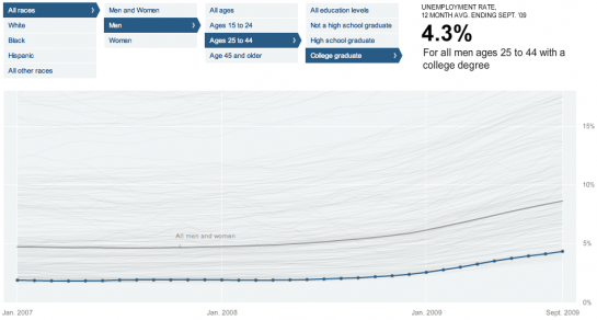
Unemployment rate was another important and recurring topic this year, and there were a lot of visualizations - maps, bar charts, and graphics - that showed it. None did it better than Shan Carter, Amanda Cox, and Kevin Quealy of The New York Times. In The Jobless Rate for People Like You, we were able to see the changes over time and filter down to different demographics. Transitions and browsability were top notch.

3. OpenStreetMap: A Year of Edits
open-street-map-edits

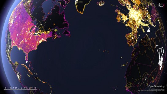
OpenStreetMap: A Year of Edits showed all the changes to OpenStreetMap data in 2008. The visualization itself, by ITO, is beautiful, and what the animated map represents - a worldwide effort in providing an accurate geographic data source - is even more amazing.

2. Protovis
protovis

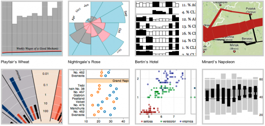
Protovis, from the Stanford visualization guys Mike Bostock and Jeffrey Heer, is a "graphical approach to visualization." More importantly, it uses Javascript and SVG for web-native visualizations, which is where things are headed with, uh, visualization on the Web. True, there are plenty of Javascript libraries that let you make basic graphs, but none are nearly this advanced, and true, Protovis doesn't work in all browsers, but if you're reading this, you're probably smart enough to be on a modern browser, unless you're locked into Internet Explorer at work.

1. On the Origin of Species: The Preservation of Favoured Traces
origin-of-species

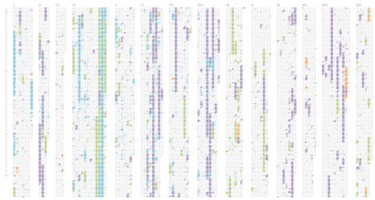
On the Origin of Species, by Ben Fry, shows the changes to Charles Darwins' theory of evolution over time. I think a lot of you missed this one, because I posted it on Labor Day, but nevertheless, it's an elegant visual. It's a simple concept executed really well. Origin shows the full growing (and shrinking) text as little blocks with an emphasis on the evolution of Darwin's ideas. They were 20 years in the making.

Origins is actually an offshoot of a much larger project yet to be released (if ever), according to Fry, so I'm of course really looking forward to seeing the rest.

There you have it. It's the top five visualizations of 2009. There was a lot of great stuff churned out this year, and no doubt next year will be even better.

Back to you - what do you think was the best visualization of the year? Leave your picks in the comments below.


Monday, December 14, 2009

Google goggles

Found this a while ago and forgot to post it. Yet another useful AR app on andriod. Thanks Mashable

Put on Your Google Goggles and Visually Search the World

Google GogglesGoogle’s breaking news left and right today. Of course the big news is that real-time search is live, but the release of Google Goggles can’t be overlooked. The brand-new addition to Google Labs is an experimental application for Android devices that supports visual search.

How does it work? Just open the app, snap a photo and voilà: Google (Google) will process the image and return search results. The photo search functionality eliminates the need to type or say anything on your mobile device, and it adds context to your real-world surroundings.

While the technology is pretty remarkable, Google admits that it is still in its infancy. So while some image searches work brilliantly — think photos of books, business cards, artwork, places, logos and landmarks — don’t be too disappointed if your image searches for food, animals, plants and cars are less than stellar.

Still, the application should prove useful, and we hope to see versions of it made available for other smartphone users as well. For now, though, iPhone (iPhone) users can turn to a number of different augmented reality applications for camera-enabled search functionality.

Watch the video below for a demonstration of Google Goggles.


Wednesday, December 9, 2009

Is there anything you can't do with twitter!?

Thanks PSFK

Twoddler Allows Toddlers To Communicate Through Twitter

Combining an Arduino microcontroller with a Fisher Price Activity Center, Bart Swennen, Gert Vos, and Johannes Taelman have put together a device which allows toddlers to communicate non-verbally with their caretakers through Twitter. Dubbed ‘Twoddler,” the device captures data from toddler interactions within the activity center and translates them to tweets that can be followed by the toddler’s parents; the toddler mashing the image of his mother for a predetermined amount of time might be translated to a tweet like ‘I’d like to see my mommy now.”


INCA Award 2009 WINNER: Twoddler from IBBT on Vimeo.

The project is the 2009 winner of the Innovative and Creative Applications Award.

[via CNET]


Explore a whole new way to window shop, with Google and your mobile phone

Nice development from Google

12/07/2009 06:00:00 AM
What if you could decide where to shop, eat or hang out, with a little help from local Google users?

It might take you a while to ask them all, so to make it easier we've launched a new effort to send window decals to over 100,000 local businesses in the U.S. that have been the most sought out and researched on Google.com and Google Maps. We're calling these businesses the "Favorite Places on Google" and you'll now start to find them in over 9,000 towns and cities, in all 50 states. You can also explore a sample of the Favorite Places in 20 of the largest U.S. cities at google.com/favoriteplaces. Each window decal has a unique bar code, known as a QR code that you can scan with any of hundreds of mobile devices — including iPhone, Android-powered phones, BlackBerry and more — to take you directly to that business's Place Page on your mobile phone. With your mobile phone and these new decals, you can easily go up to a storefront and immediately find reviews, get a coupon if the business is offering one or star a business as a place you want to remember for the future. Soon, you'll be able to leave a review on the mobile page as well, just like on your desktop.


To scan the codes, you'll need a phone with a camera and an app that can read QR codes. For Android-powered devices, including the Droid by Motorola, we recommend using the free Barcode Scanner app. For iPhone, we have found the $1.99 QuickMark app to work best, and starting today, we're partnering with QuickMark to offer the app for free for the first 40,000 downloads. For other devices, we recommend searching for "QR reader" in your app marketplace, if it has one, or searching for the model of your phone and [qr reader] on Google. BeeTagg and NeoReader are two other apps that we've found to work well with the decals.

Here's a video that shows you how this all works:


This launch is part of our overall effort — online and offline — to provide you with the best local business results whenever you're trying to figure out where to go, whether it's a trendy Cuban restaurant in Philly, a comics shop in L.A., a hip hotel in NYC or a little bit of photographic history in Rochester, N.Y.

We plan to periodically send out new waves of window decals to qualifying businesses. If you own or manage a business and were selected as a Favorite Place, you may have already received your decal or, for most of you, it will arrive by mail in the next one to two weeks. If you weren't selected in this round, your first step is to claim your listing with Google's Local Business Center
for free. That will help us determine that your business information is correct. Then, you can enhance your local business listing by adding enhanced content like photos and videos.

To explore a gallery of several hundred Favorite Places in 20 U.S. cities, to learn more about how to use the QR codes and to find out how your business can get involved, check out google.com/favoriteplaces.


Wednesday, November 25, 2009

Universal Platforms for Virtual Goods and Social Currency

Thanks Mobile Behaviour for this on Viximo's interesting offering for virtual economies

socialcurrency

Social currency and virtual goods have kept online gamers locked in their basements for years. Then Facebook introduced us to the virtual gift, and digital birthday cakes became badges of honor. Now game dynamics are becoming an increasingly popular way to encourage behavior online and on mobile, turning life into one big game.

A new startup called Viximo is looking to help smaller social sites build their own virtual goods platforms. Their turnkey solution includes an embeddable gift store, showcase and microtransaction system.

"Our virtual goods solution is designed to provide social networks with a powerful solution they can grow with, yet spend only a week integrating," said Brian Balfour Founder and VP of Product Marketing at Viximo. "This allows web publishers to focus on their core business--engaging their audience--while we provide their users with targeted and merchandised virtual goods through a well vetted and integrated system."

Viximo's solution supports various types of virtual currencies including cash, reward, mixed, or dual currency systems, and aggregates the best payment methods including one click credit card purchasing, PayPal, mobile, and CPA offers.

Techcrunch points out that Viximo’s ‘universal giftbox’ option, which allows for a gift given on one site to also appear on another site, could be both confusing and ugly. This is a good point, but it would be great to see some standardization across networks, not just for virtual goods but for all the gaming elements we're seeing built into social networks and media sites.

Thought Starter:

With the proliferation of “leaderboards” – the hot new SNS accessory that quantify site activity (see Foursquare, Fashism, Hypemachine, Learnvest…)—there’s an opportunity to create a points exchange. So just like you can use your frequent flier miles on partner airlines, you could redeem currencies on partner sites. Or how about a platform that aggregates social currencies and lets you redeem them for branded rewards?


Tuesday, November 24, 2009

Google wave - 5 case studies

Thanks Mashable for this first look at how the Wave is being applied.

--

The Google Wave invite rollout extravaganza started more than a month ago. While in some respects the buzz around Google Wave has started to subside, the term is still constantly one of the top trending topics on Twitter, and new gadgets, extensions, and applications are now starting to appear on a daily basis.

Each day more and more people are opening up their email inbox to find an invite to Google Wave (Google Wave). With that shiny new invite comes the inevitable quest for ideas about to how to put the medium to good use.

Should you happen to be one of those people, we’ve got a number of different resources that you can use to get up to speed with Google Wave. This time around, however, we wanted to look at how people are actually using it now. From process modelling and customer service, to project collaboration, annotation, and gaming, the examples listed here highlight the power of the newborn medium, and in part, showcase what we can expect as the platform matures.


1. SAP Gravity: Modeling within Google Wave


Understanding the power of real-time collaboration and its relevance to clients, SAP Research in Australia (Australia) has developed a business process modeling tool called Gravity that works within Google Wave.

The sophisticated tool, which can be embedded within a Wave as a gadget, allows for team members to remotely build complex models in unison, or after catching up via playback, without having to leave Google Wave.

Gravity and Google Wave work together harmoniously to create a modeling environment that appears to be just as robust as, if not more flexible than, expensive desktop software built for the same purpose.

We think SAP is certainly on to something here, and we encourage you to watch the video demonstration of Gravity in Google Wave in action.


2. Salesforce: Google Wave for Customer Service


Salesforce, like SAP, has figured out that they can use the Google Wave platform to support client needs and tackle real-life problems. As such, Salesforce has created a Google Wave extension that clients can use to help automate, and even personalize, the customer service experience.

Watch the demonstration video to see how the Salesforce extension gives customers the ability to use Google Wave to interact with an automated support robot. Of course, customers can request assistance from a human within the Wave as well.

What makes this example stand out is the fact that not only is the Google Wave dialogue being stored as a case record within Salesforce, but, because the robot is connected to the Salesforce Service Cloud, the robot can access previously stored customer data for tailored service. Ultimately, Salesforce has found a way to potentially save clients money on customer service efforts, all the while maintaining active records, with the assistance of Google Wave.


3. Mingle: Integrated Project Collaboration


mingle

Mingle is a project management and team collaboration tool developed by ThoughtWorks Studios, who realized that they could add Mingle’s project management metadata to conversations in Google Wave.

The integration is still a work in progress, but a demonstration of the concept was highlighted at Enterprise 2.0, and the basic idea is to give Google Wave users/Mingle clients the ability to bring their Mingle task data, which takes the form of cards, into Google Wave. Existing Mingle cards can be embedded into Wave conversation threads, and new Mingle cards/tasks can be created within Google Wave.

This particular use case highlights how Google Wave can work with existing project management systems for more streamlined and cohesive communication, creating parity regardless of where the user is accessing project data.


4. Ecomm Conference: Annotating a Live Event


Just last week our CEO, Pete Cashmore, wrote about how the savvy people behind the Ecomm conference doled out Wave accounts to attendees so that they could collaborate, in real-time, to annotate presentation content. The result was arguably a much better way to consume conference content than attempting to follow hashtag tweets on Twitter (Twitter).

You can read the full account, which was documented by Charlie Osmond, on the FreshNetworks blog, but here’s an excerpt that we think drives home the utility of the use case.

“Here’s what happened: an audience member would create a Google Wave and others in the audience would edit the wave during the presentation. The result would be a crowd-sourced write-up of the presentation: a transcript of key points and a record of audience comments.”

We happen to think this particular use case is genius, especially for content-rich seminars and events where attendees are typically taking their own individual notes. With the shared Google Wave experience they can combine forces to create a more meaningful and accurate recounting of information shared in conference sessions.


5. Gamers: Google Wave RPGs


rpg index

A very detailed Ars Technica post highlights that there’s a growing collection of Google Wave users who are using the medium to play wave-borne RPGs (role playing games). As mentioned in the post, there’s a even a Wave dedicated to serving as an index for all the Wave RPGs currently in existence, and the last time we counted it included upwards of 300 contributing members, and a combination of 30 different ideas or full-fledged games.

traveller

According to Jon Stokes, the author of the post, Google Wave is adequate for some RPGs, but it could certainly be improved to allow for a more enjoyable experience. In the excerpt below, Stokes describes the current RPG (RPG) experience within Google Wave:

“The few games I’m following typically have at least three waves: one for recruiting and general discussion, another for out-of-character interactions (”table talk”), and the main wave where the actual in-character gaming takes place. Individual players are also encouraged to start waves between themselves for any conversations that the GM shouldn’t be privy to. Character sheets can be posted in a private wave between a player and the GM, and character biographies can go anywhere where the other players can get access to them.

The waves are persistent, accessible to anyone who’s added to them, and include the ability to track changes, so they ultimately work quite well as a medium for the non-tactical parts of an RPG. A newcomer can jump right in and get up-to-speed on past interactions, and a GM or industrious player can constantly maintain the official record of play by going back and fixing errors, formatting text, adding and deleting material, and reorganizing posts. Character generation seems to work quite well in Wave, since players can develop the shared character sheet at their own pace with periodic feedback from the GM.”


Friday, November 20, 2009

Hit the bitch

Powerful, anti-violence campaign from Denmark, Thanks Adverblog

---

Sorry for the strong language, but this is the title of a new social campaign from Denmark. The campaign is literally in your face as you have to punch the featured girl to get the message. Most disturbing is that you want to go all the way through, which make you feel like a 100% idiot once finished. But the message, even though it's in Danish, is very clear.


Schermafbeelding 2009-11-16 om 20.54.28.png

Crowdsourced company purchase

Nice idea with a lot of traction behind it: http://buyabeercompany.com/

Interesting to see what happens when they hit the 300M... will everone cough up for a round?

Tuesday, November 17, 2009

Marmite pop up store


Love it or hate it, a pop-up shop devoted to iconic British yeast spread Marmite has opened at the Piccadilly Circus end of London’s Regent Street.

Spread over two floors and created by fledgling design company SunHouse Creative, the lower ground floor is devoted to product, while upstairs is a 1950s-style tearoom where shoppers can enjoy a cuppa and a round of toast with Marmite.

The store features a raised plinth in the window where a pair of mannequins are seated at a breakfast table where Marmite takes centre stage, while behind them is a pyramid constructed from Marmite jars. Elsewhere, other oddities include a black turntable on which jars of the condiment spin endlessly and a bamboo bird cage containing a jar of the black stuff.

At the back of the shop, a multi-colour Union Flag with a Marmite jar at its centre covers the whole of the rear ground floor wall. Painted by recent graduates from The Royal College of Art, it was created during the course of three days, according to Rupert Pick, director at Hot Pickle Trading, which runs the shop.

The store will remain open until the end of the year.


Published in Retail Week: 16 November, 2009 | By John Ryan

Thursday, November 12, 2009

Immaterials: the ghost in the field

Some cool visualisations of RFID fields. Would be amazing if this could be done in real time, in-situ where the readers are installed. Could really make swiping that card a lot more engaging...

Immaterials: the ghost in the field from timo on Vimeo.

Wednesday, November 11, 2009

Pepsi's Stimulus Plan: Putting Up Money To 'Refresh' Communities

Thanks GENWOW for this on Pepsi's impressive take on how to engage with communities... going to be interesting to follow this one.

Pepsi refresh project Call it the American Renewal and Refreshment Act.

First, Pepsi seemed to have taken its cue from Barack Obama when it refashioned its logo.

Now, it appears to be stealing a page from the Obama administration with the "Pepsi Refresh Project," a campaign designed to pay up to $20 million for projects people create to "refresh" their communities.

The whole thing gets underway in tomorrow's (Tuesday"s) Wall Street Journal and USA Today. According to the AP, the effort will fund thousands of projects, and could involve getting other businesses to participate. Consumers will list their projects online and vote on winners.

Not to be outdone, Coca-Cola seems to be taking a cue from Obama's diplomatic overtures in a campaign that will send three people - chosen by online voters - to 206 countries as part of its ongoing "Open Happiness" campaign.

How all this plays in 2010 - think about those president's-party-on-the-outs mid-term elections - remains to be seen.

Will Pepsi move past Obama to whatever's next to capture the zeitgeist?

Now that would be refreshing.

Read more, here.


Tuesday, November 10, 2009

Making Concrete Interactive

Even the walls are talking... thanks PSFK

Light-Sensitive Concrete

Tokihiko Fukao of the University of Tokyo has developed a new kind of light-sensitive concrete. The material is sensitive to ambient light levels, able to take note of the luminosity distribution across it’s surface. The incoming light level data is then routed to a computer. This turns the concrete into a kind of control surface where varying degrees of illumination can be used to direct different audio and visual outputs.

Transmaterial explains more:

Light-Sensitive Concrete consists of concrete, embedded optical fibers, photodiodes, and electrical circuitry. Optical fibers are distributed within a regular grid, and sensors are attached beneath them in the same arrangement. The interactive properties of the material are intentionally hidden within what appears to be conventional concrete—suggesting possibilities for other light-sensitive building materials and surfaces as part of a total ambient interactive system.

Transmaterial: “Light-Sensitive Concrete”


Presence In Absence: Digital Heirloom Anchors Digital Communications

Two nice posts from PSFK ... think this is such a cool way to tie digi and real worlds together

November 9, 2009

Digital Heirlooms Warm Up Computer Mediated Communication-6

Noting the growing number of long distance relationships and the primarily digital communications channels that sustain them, Irish designer Colm Keller has created a digital heirloom set which can act as a beautiful physical anchor for sharing experience. The Presence In Absence kit is composed of a digital scrapbook carved out of birch with two porcelain caps. A provided knife lets users cut the into two pieces for each person to carry. A porcelain hub lets the couple plug in and share gathered digital bits and memories when they get together in real life. Similar to Mimi Son’s Diary Objects project, Presence in Absence adds a more tangible, personal element to transient digital communications.

[via designboom]


Interactive wine bar


Clo winebar features a revolutionary multi-user, multi-touch projection menu, which allows customers to easily explore and find information on over 100 wines available. Guests can learn about a wine, its history and tasting profile, then quickly find its location within the bar. If a more human touch is desired, Clo offers a full staff of knowledgeable sommeliers.


Thursday, November 5, 2009

Four Mobile Applications That Peer Into an Augmented Spiritual World

Spooky AR thanks to Mobile Behaviour

Four Mobile Applications That Peer Into an Augmented Spiritual World

Fatal_Frame_II_Camera_Obscura_by_RennaRevelin

Japanese video game Fatal Frame spun a narrative around the capturing of spirits using a camera obscura, viewing a spiritual world through man-made lens. Sure it's a little eerie, but the hype-machine that is augmented reality builds off a similar concept, allowing us to peer into the digital realm. Developers have played with this idea, creating mobile applications that imitate Japanese folklore.

ghostwire-nintendo-dsi

Ghostwire for the Nintendo DSi uses the embedded microphone and camera to allow users to scan the room for ghosts and then bribe them away.

ghostcam2

GhostCam for the iPhone gives the ability to haunt any captured image, making for a fun scare. Ghost Radar detects nearby spirits and provides a flux readout alongside any words spoken. Finally, Mobilizy released an augmented reality app that gives users a disturbing view of the lost Twin Towers. All of these add to the mystery of the unknown. Happy (belated) Halloween.


Tuesday, November 3, 2009

Your Augmented Future: The 3 Hottest Videos From International AR Symposium

Cheers Read Write Web for these peaks at where AR is heading

Written by Marshall Kirkpatrick / October 26, 2009 12:09 PM / 4 Comments

3D virtual pets to hold in your hand and interact with, software that turns drawn objects into movable 3D objects subject to the laws of physics and a Microsoft hiring-coup. Those are the stories behind the hottest videos from the eye and brain-candy world of Augmented Reality, as seen at last week's International Symposium on Augmented and Extended Reality in Orlando, Florida.

Who says the web is all about pages that you view in a browser? Check out these three visions of a fast-approaching future where data is drawn from and overlaid on top of the real world around us.

Kid Stuff: Eye Pet

The Eye Pet is a virtual critter that you can interact with through a webcam on your computer. Check out this demo where the Sony Computer Entertainment Europe pets the animal and spins through a 3D menu of toys to play use in playing with it. It's pretty awesome. The Eye Pet is expected to be released for the PS3 game system as early as next month.

That looks like a lot of fun for kids (who knows about the psychological impact) but imagine other interactive 3D objects with menus of options like this. Occupational training possibilities? Sports practice? There seems to be a lot of possibilities.

Thanks to Canadian PhD student Gail Carmichael for shooting that video.

The New AR Paradigm: AR Sketch

We wrote about this international project last week and the team behind it went on to win the Best Student Paper award at the ISMAR conference.

AR Sketch takes drawn images, processes live video capture of the drawings and turns them into 3D image overlays. Then it subjects them to a physics simulation. The team behind it just happened to hack into the private API for live video processing on the iPhone and make it available to developers around the world, too.

Popular AR apps like Yelp or Layar on mobile phones don't actually know what they are looking at, they just know where you are and which direction you're facing. Thus they can tell you what they believe you're looking at. Marker-based AR apps know only to look for one thing - a printed marker with a pattern on it that triggers display of an overlay. Sketch AR needs neither guesses nor markers - it processes and augments what you're actually looking at.

It's nuts. As Ori Inbar wrote about the Sketch AR team in an overview of ISMAR, "Their work is revolutionizing the AR world by avoiding the need to print markers - or any images whatsoever."

Here Comes Microsoft AR!

Oxford's Georg Klein, whom Inbar calls "the smartest Computer Vision guy on the block," just joined Microsoft this month, conference-goers learned. Is Microsoft going to make a major Augmented Reality play? They'd be fools not to explore the possibility. They don't want to be left out in the cold if AR does become the next version of the web. Here's what their new man's been working on.

wrap310.jpgThese exciting examples of Augmented Reality have little to do with mobile location awareness, a nice reminder that there's a whole lot more to the field. Mobile AR browsers are the best known commercial services so far, but academic research on other forms of AR has been going on for years.

Ready to browse and interact with data on top of the physical world, through webcams, mobile phones and increasingly svelte AR glasses? A future when such experiences are mainstream may be fast approaching.


App-vertising

Thanks mobile behaviour for this look at the rise of the app as an ad channel. Personally i think it's just the latest bandwagon for an approach that I support but has been long touted - less advertising and more delivering services that people find useful. Mobile and online apps provide handy ways to do this, but at the end of the day it’s common sense that being useful is better way to get people to favour you than yelling at them is.


As Attention Swings Towards Mobile, The Rise of "App-vertising"

iphone apps

Every week we see dozens of new applications released, with a few which manage to improve our lives in some shape or form. It's clear that developers are keen on creating the next big thing and user attention is obviously on the app store. Earlier this month USA Today even declared the existence of so-called app addiction, with possible health issues tied to excessive mobile app use. While the iPhone app store is still young, many marketers have noticed the number of eyeballs checking in during this shifting attention economy. Welcome to an age of "app-vertising."

blogSpan

Last week Volkswagen took a unique and cost-efficient approach to advertising its new GTI using just an iPhone app. Their reasoning included a comparison between a prime-time audience for a television show like NCIS (21 million), and reported iPhone and iPod touch customers worldwide (over 50 million). With a lower cost and an additional PR value, Volkswagen took the ladder, receiving both increased engagement and more for their money.

alice in chains iphone

For musicians Alice in Chains, the app store was attractive in a slightly different fashion. To push their new album they are releasing an app, with videos, photos, news, and entire audio track-list included. If brands can advertise using apps, why not musicians? No matter what the product, marketers are being drawn to where the consumer user is, the app-store. This new destination is ripe with opportunity for those who are able to create a niche utility for enhancing our daily routine.


Thursday, October 29, 2009

Using Flickr as a Paintbrush

Thanks Flowing Dat afor this cool project that brings a bit of (average hue) colour ot mapping

Posted by Nathan / Oct 28, 2009 to Mapping / Add your comment

Using Flickr as a Paintbrush

Andy Woodruff from Cartogrammar uses average color in Flickr photos to map the colors that people take the most pictures of. The above for example, shows the common colors of Harvard Square. Why all the red? It's because there's so many brick buildings.

So in the end is a map that provides a different geographic view of what we're used to seeing. We're used to seeing the aerials or the designer-defined color coding of roads and land. This however, while portrayed as a view from above, is what people are seeing on the ground.


Tuesday, October 27, 2009

‘Virtual Street Corners’ Connects Socially Isolated Neighborhoods

Cheers psfk once again... awesome project

October 22, 2009

'Virtual Street Corners' Connects Isolated Neighborhoods

Roxbury and Brookline are connected by the Route 66 bus line and separated by only 2.4 miles, but socially they are worlds apart. Roxbury is a poor, urban neighborhood in Boston proper and Brookline is a wealthy, suburban neighborhood just outside the city. As of today, the communities rarely interact. Thanks to an interesting project named Virtual Street Corners that is all about to change.

Scheduled to debut May 15th 2010, Virtual Street Corners takes a large storefront window located in front of a bus stop in each neighborhood and transforms it into a video screen. These video screens, which will stream a real-time feed 24/7, will literally provide a window into the other community in an effort to encourage the residents to interact. The screens will also serve as media centers for news collection and reporting, creating a ‘virtual town hall.”

In order to facilitate personal interaction and news reporting, Virtual Street Corners has organized three citizens from different areas of each town to report daily news on a scheduled basis. In addition, there will be a website that streams both live feeds and hosts podcasts/videocasts for download.

Virtual Street Corners

[via Kenji Summers]


Shoe-Shopping via Short Code

Thanks Next Great Thing for this post on short code shopping

Despite th obvious issues the author pioint sout, i think it's an intersting way to run ecommerce in a low-fi way

October 5, 2009 by NGT

Shoe-Shopping via Short Code

shoptext2

Not counting content for the mobile phone, like ringtones, mobile commerce is still in its infancy in the United States. From fast food (Papa John’s) to fashion (Net-a-Porter), marketing and sales executives with pioneering attitudes have been experimenting with mobile commerce. Many are still trying to figure out what does and does not work in connecting with consumers and their wallets via their mobile phones.

Since most US mobile users still do not have a smart phone, companies have to decide whether to offer a richer experience via an optimized mobile Web site or app, but to potentially fewer customers, or reach more customers via something almost every mobile user has, such as SMS. While at first blush it might seem best to err on the side of scale, my recent experience with an SMS-based m-commerce platform convinced me otherwise.

Here's how it went down. A few weeks ago while on vacation, I was flipping through a women’s magazine and came across an ad which contained a potentially cute pair of shoes. As there was a mobile call to action and I was nowhere near my laptop, I was intrigued. I texted the code to the short code and the process began.

shoptext

However, several messages back and forth later, I did not buy the shoes. Never having shopped for anything this way or from this service or retailer before, I was not sure what to expect. Other than “standard messaging rates apply,” neither the ad nor the first message from ShopText (on behalf of the retailer) offered any expectations. The process itself was a long series of messages, which seemed to take longer than if I had just gone to my nearest Internet connection, logged on and created an account. Frustrated, I aborted somewhere along the way (again, not sure how far along as nothing was communicated regarding what to expect).

My issue was not just with the cumbersome and unclear nature of the shopping process itself. Unfortunately, shopping by text message did not meet the high bar for shopping for shoes virtually that sites like Endless and Zappos have set. The print ad offered almost no detail in the photo and accompanying text and none of the text messages offered any additional details (thus, why I earlier referred to the shoes as “potentially cute”). I had no idea what the heel height and type were, what type of pattern had been laser cut into the leather, if there was a platform in the shoe, etc. These are all extremely important details to me, as I expect they are to most women, when evaluating a shoe.

Even though I found my particular experience lacking, I have to applaud this retailer and magazine for trying to increase the engagement with their young, connected, female consumers via the ShopText platform. They recognize that there is a real opportunity in connecting with consumers via their mobile phones, an item that most consumers state they cannot and do not live without (per Synovate’s recent research that found “three quarters of the survey respondents - including 82% of Americans - never leave home without their phones, and 36% of people across the world (42% of Americans) go as far as to say they 'cannot live without' their cell phone”).

However, for m-commerce to outgrow its baby shoes, all of the parties involved need to rethink how women are accustomed and want to shop for shoes virtually. Otherwise, for this category of goods, ShopText will need to clarify the level of service offered by renaming itself “OrderText.”

- Valerie Cashour